
Medical bill manager
RESEARCH | SYNTHESIS | PROJECT STRATEGY | INTERACTION DESIGN | PROTOTYPE + TEST | UI DESIGN
MY ROLE: Lead designer and researcher—responsible for all content unless otherwise noted
TIMELINE: Five months
COMPANY: Ruby, a B2C startup
Background
Medical emergencies set off avalanches of bills that leave people feeling powerless, frustrated, and overwhelmed. It was while developing the Medical Emergency Kit—a tool to help users collect and have at the ready the key documents they would need in case of an emergency—that Ruby saw an opportunity to create a product to help people with the bills that assuredly follow.
The Challenge
Produce an MVP for an app that informs and empowers users to take charge of their medical bills.
The Outcome
Working closely with my Project Manager and developers, we created an app that addresses the major pain points identified by people struggling to deal with medical bills. Importantly, the app also educates users on how to negotiate their medical bills, potentially saving thousands of dollars.

all bills in one place
A major cause of frustration is not having a clear sense the total amount owed and to whom. I designed a dashboard that provides users a simple way to see bills from multiple providers in a single screen.
Keep better track of bills
People need a better way to keep track of a bill’s progress. In response, I devised an interactive timeline for users to record notes, payments made, and set reminders and to-dos.


encouragement and hope
To help combat the feelings of helplessness and overwhelm, I designed little moments of celebration into the app experience. I also made a point to include visual indications of progress to help reinforce to the user that there’s a light at the end of the tunnel.

Research + Discovery
Before undertaking this project, my project manager and I set out to first understand the problem. I created a research plan to clarify what we wanted to learn and the methodologies we'd use to do so.
Market Research
We dove into the world of medical bills, learning terminology and conducting competitive analysis.
Key findings
Dealing with insurance and medical bills is super stressful. There’s a lot of studies out there that validate that medical bills produce confusion and anxiety for people.
Medical bills have a lot of errors. Nearly 80% of bills are incorrectly coded, causing a huge amount of incorrect charges. Comparing codes to an EOB is time consuming task for someone who is already struggling with their health.
Presently, there’s only one other main competitor. As far as digital tools to specifically help with medical bills, the lack of competitors in the space surprised us.
Subject Matter Expert
We partnered with an extremely knowledgable Patient Advocate who served as a guide into world of medical bills. For example, she broke down the negotiation process into this handy flow chart.
Quantitative Research
In order to validate some assumptions, we conducted a survey with participants who reported having a medical event within the last two years.
Key findings
The overwhelming majority reported being only somewhat confident in their ability to understand bills and insurance.


Qualitative Research
After drafting my interview guide which outlined my research goals and interview questions, I recruited participants who reported that they were currently struggling to deal with medical bills.
Key takeaways


““...it just turned into a nightmare from there. I’m not even certain I’ve even paid off all of those medical bills and I’m still dealing with medical bills for my new baby. It’s overwhelming.””

Synthesis + Defining
Uncovering Insights + Identifying Needs
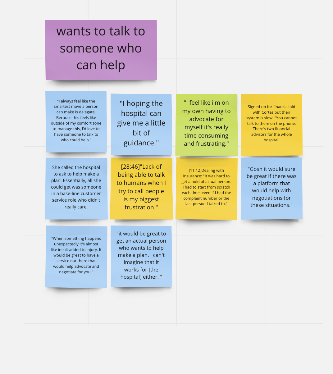
I broke down participants’ statements and my observations onto post-its and charted them out using an empathy map.


Defining the Design Challenge
Using the empathy map helped me to identify the key needs to be addressed. I translated these needs into insights, then reframed them as How Might We questions.


Primary User Persona
Taking the key insights that I learned about participants' behaviors, needs, and goals, I used a variable map to visualize the data. I then created a persona that embodies these patterns.

Brainstorming
Now that I knew the primary questions we were trying to answer, I gathered team members and led a brainstorming session. When clustering our ideas, we found that the three key themes arose: Organization, Guidance, and Payment Plan Assistance. We voted on the proposed solutions that we felt were the strongest.
Project Strategy
Defining MVP
Based on the research conducted, we felt confident that the final product would need to encompass all three themes. However, for MVP, we needed to narrow the scope. How to decide which features to focus on? With testing, of course. I drafted a test plan to outline my approach which included concept testing and card sorting.

Concept testing
I created three separate mid-fidelity prototypes to test, one for each theme: Organization, Guidance, and Payment Plan Assistance
Key takeaways
The participants’ excitement was really encouraging. Our presumption was that Payment Plan Assistance would test the highest. Much to our surprise, the Organizing feature set was the clear winner. The most valuable features overall were the timeline, the ability to see all bills in one place, and negotiation help.
““This is empowering! It’s embarassing how much knowledge we lack about the billing system.””
Interaction Design
User Flow
I created a site map and plotted a user flow for our persona onto it.
Mid-Fidelity Wireframes
I first sketched out designs, then translated those sketches into mid-fidelity screens. Here’s a few that show a variety of features of the app.


Prototyping + Usability Testing
The testing and iterating phase lasted several months. For each test, I created a usability test plan to clarify what we sought to learn.
Insights from Usability Testing
Each round of testing resulted in design improvements and insights about user needs. I created an experience map that captures what was learned.

KEY FINDINGS
There needed to be more points of encouragement and indication of progress
The Oooh! moments were consistently: the ability to talk to someone, the timeline, and the negotiation script
The timeline feature was important enough to need to be accessible through the bottom nav
One main finding was that we were treating payment plans differently than bills. Realizing they should be treated the same way was a major revelation and helped things really click into place.
UI Design
For the sake of time and to reduce the load on developers (and because the plan was to launch first on Android), I decided to use Material’s UI components. I created color palette and typography system and converted mid-fidelity wireframes into high-fidelity.
High-fidelity Wireframes
Here are a few screens that demonstrate key features of the app.


Design System
I complied all of the design elements and components into a design system. This serves as a reference guide to help ensure consistency across the app and for future products.

final takeaways
There were definitely hurdles to overcome and pivots to be made along the way. For example, the original plan was to integrate with a bill scanning API so that a user could simply snap a photo of their bills. This ultimately was scrapped due to cost, so we had to reroute with a manual entry design.
During testing it became increasingly clear that negotiation needed to be the focal point of the MVP so we pivoted to focus on a feature that would guide users through the process. Another example was when we realized that our mental model of a payment plan as something separate from a bill was overcomplicating things and as a result, simplified the design.
Overall, this project was a major testament to the power of communication and teamwork. Our small team rallied to develop an MVP in just over four months. I believe in the ability of this app to really help people in a time of need and am proud to have played a part in creating it.
Next Steps
Throughout the research and testing process, one major pain point that continued to arise was confusion about insurance. I would love to explore options for integrating information and features to help users with this particular challenge.